How much can you take away from a typeface?
How do you bring heritage into the letterforms without illustrating it?
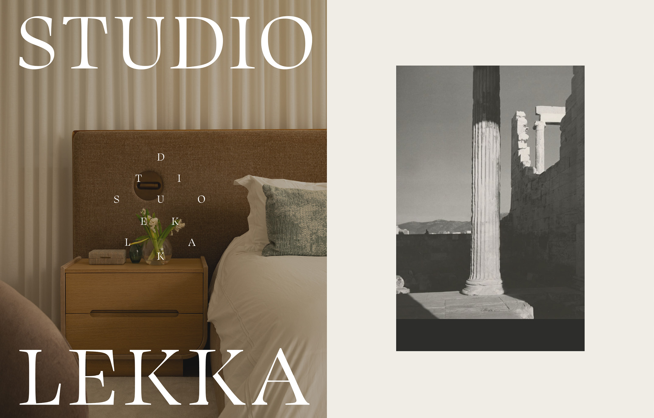
Greek and Italian heritage needed to be present in Studio Lekka’s identity without relying on obvious Mediterranean motifs.
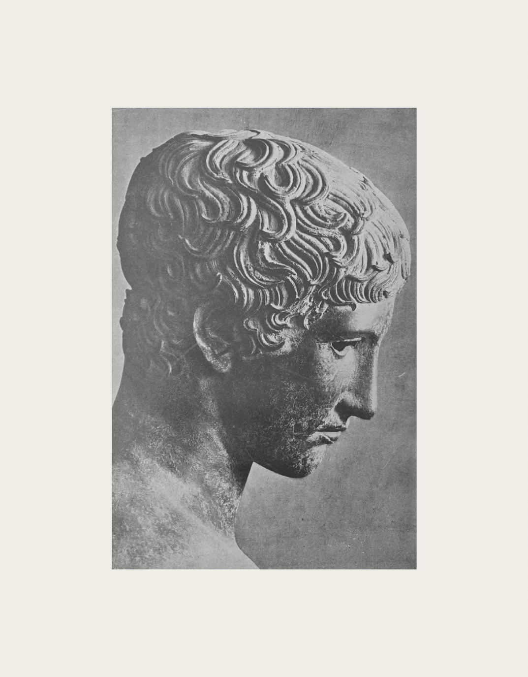
Karolina Loboda, the designer behind the identity, found a way into the typography through photographs from Greece and Italy, especially weathered inscriptions and fragmented architectural details.
“I was interested less in reproducing any one historical alphabet than in observing what time does to a letter: edges soften, sections disappear and once-precise forms become uneven.”
Instead of copying those forms, Karolina focused on what time had done to them. An edge could soften. Part of a letter could disappear. Something precise could become irregular.
That made the choice of typeface important.
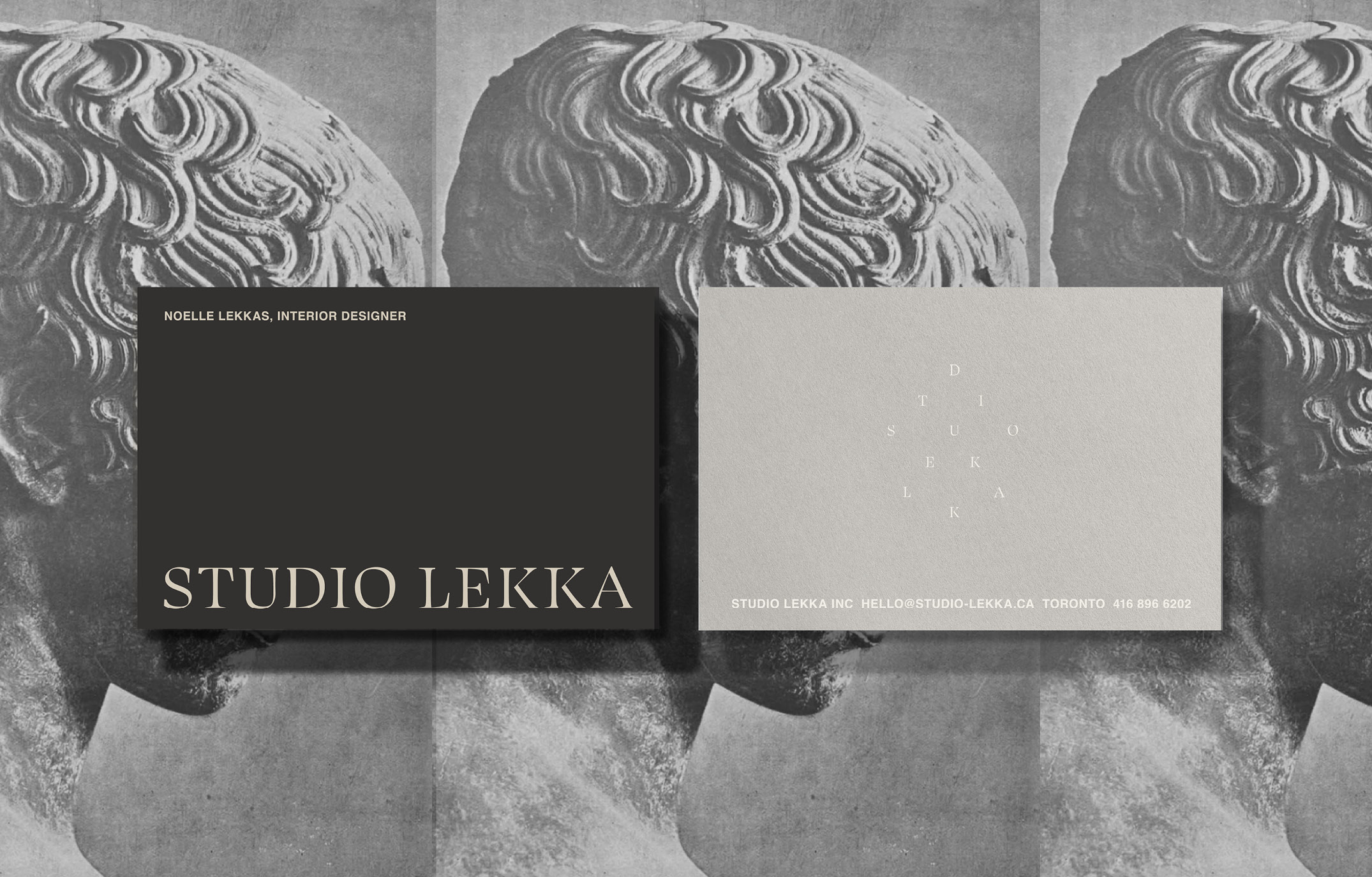
What kind of typeface can you do that to?
Swear Display had what Karolina calls “the right tension”. It had enough classical character to suggest history, but still felt contemporary.
Just as importantly, it gave her something solid to work with.
“Swear Display gave me a sophisticated underlying structure that I could disrupt without losing refinement.”
The choice was not only about how Swear looked. It was also about what it could withstand.
Why modify it instead of drawing something new?

Swear already had the proportions, contrast and curves Karolina wanted. Drawing a new wordmark from scratch would have meant rebuilding those qualities.
So she kept the structure and changed the letters.
The process became subtractive. Instead of adding character, she could take something away.
How much can you take away before the personality changes?

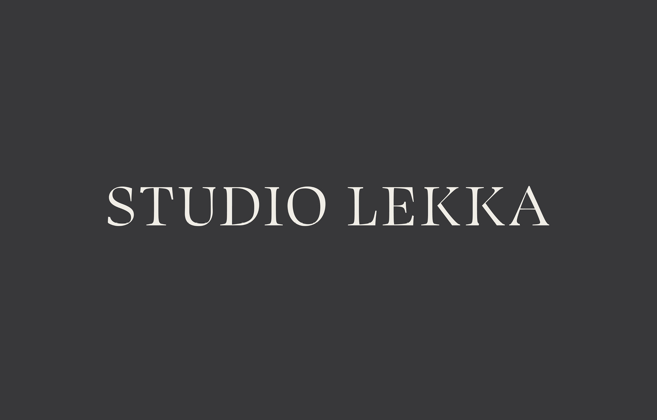
The erosion in the final wordmark is easy to miss at first. That was intentional.
Karolina kept checking the same things: legibility, rhythm and silhouette. If an alteration weakened the word or made it feel rustic, she had gone too far.
Restraint mattered for another reason too. Studio Lekka works with luxury clients, and Karolina wanted the identity to feel timeless rather than loud or trend-driven.
“I wanted the erosion to be something you feel before you consciously see.”
The erosion is there, but it does not arrive first.
The elegance does.

The wordmark was designed to reveal itself in a particular order.
“I wanted the wordmark to hold your attention through its craft first, the letterforms, the proportions, and only then reveal that something has been deliberately altered. That sequence, elegance first, erosion second, was the intention all along.”
The intervention had to remain quiet enough for Swear’s elegance to register first.
Elegance first, erosion second.
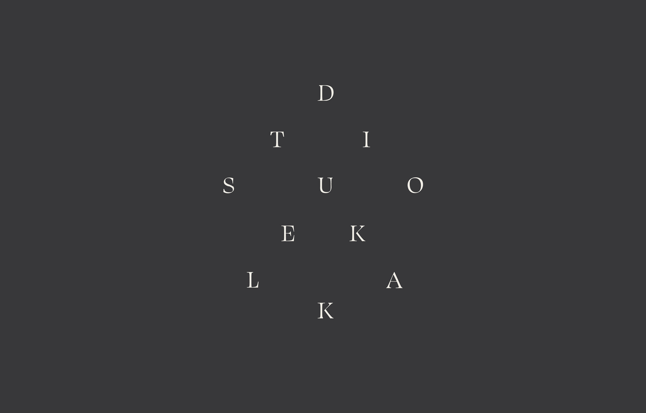
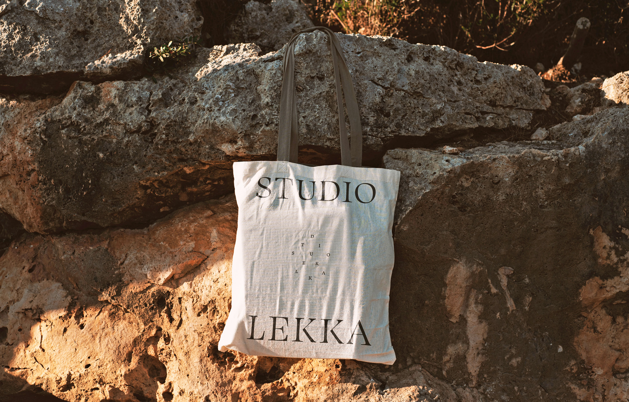
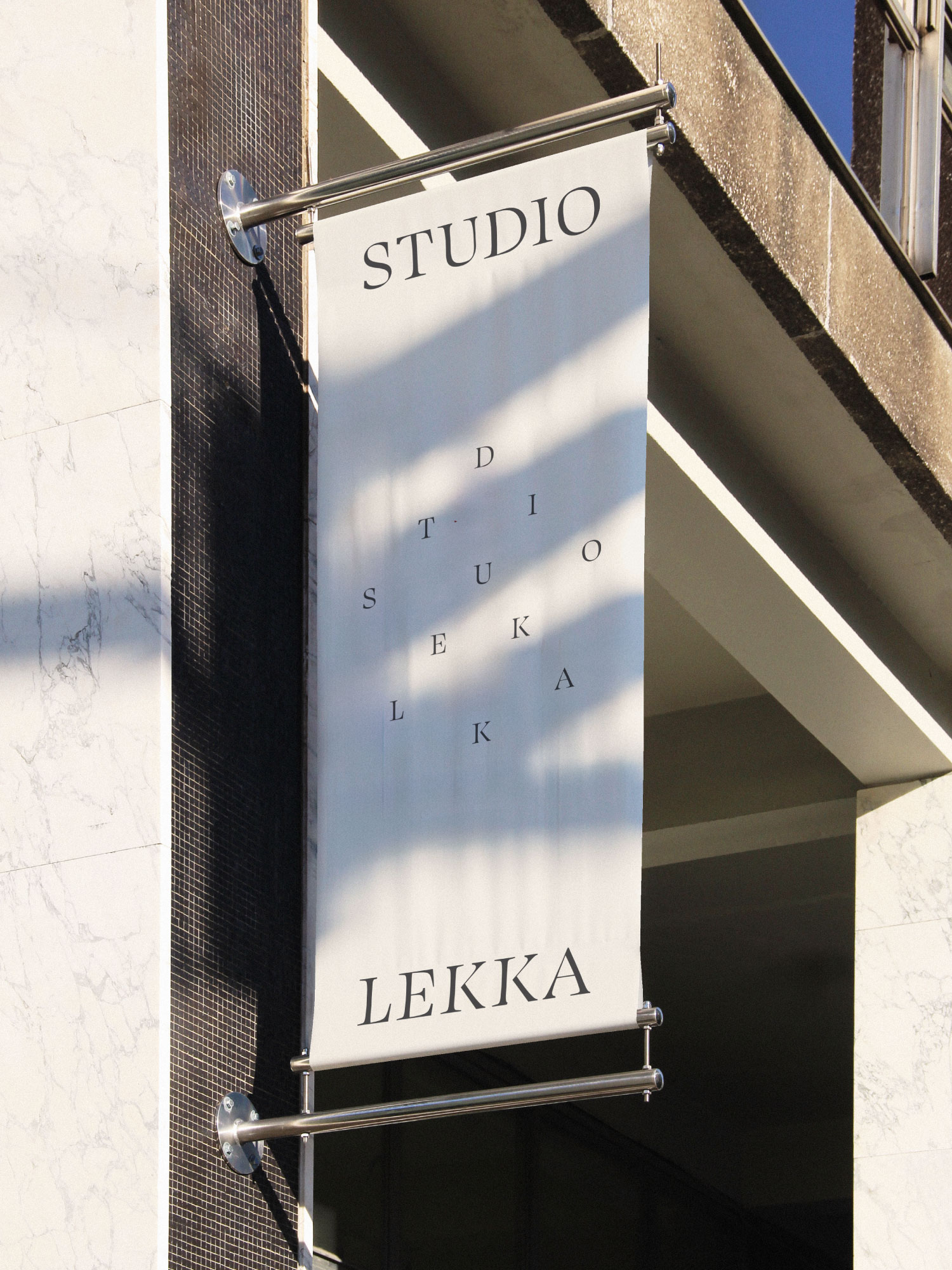
Would another elegant typeface survive the same treatment?
Studio Lekka made us wonder whether the same approach would work with another typeface.
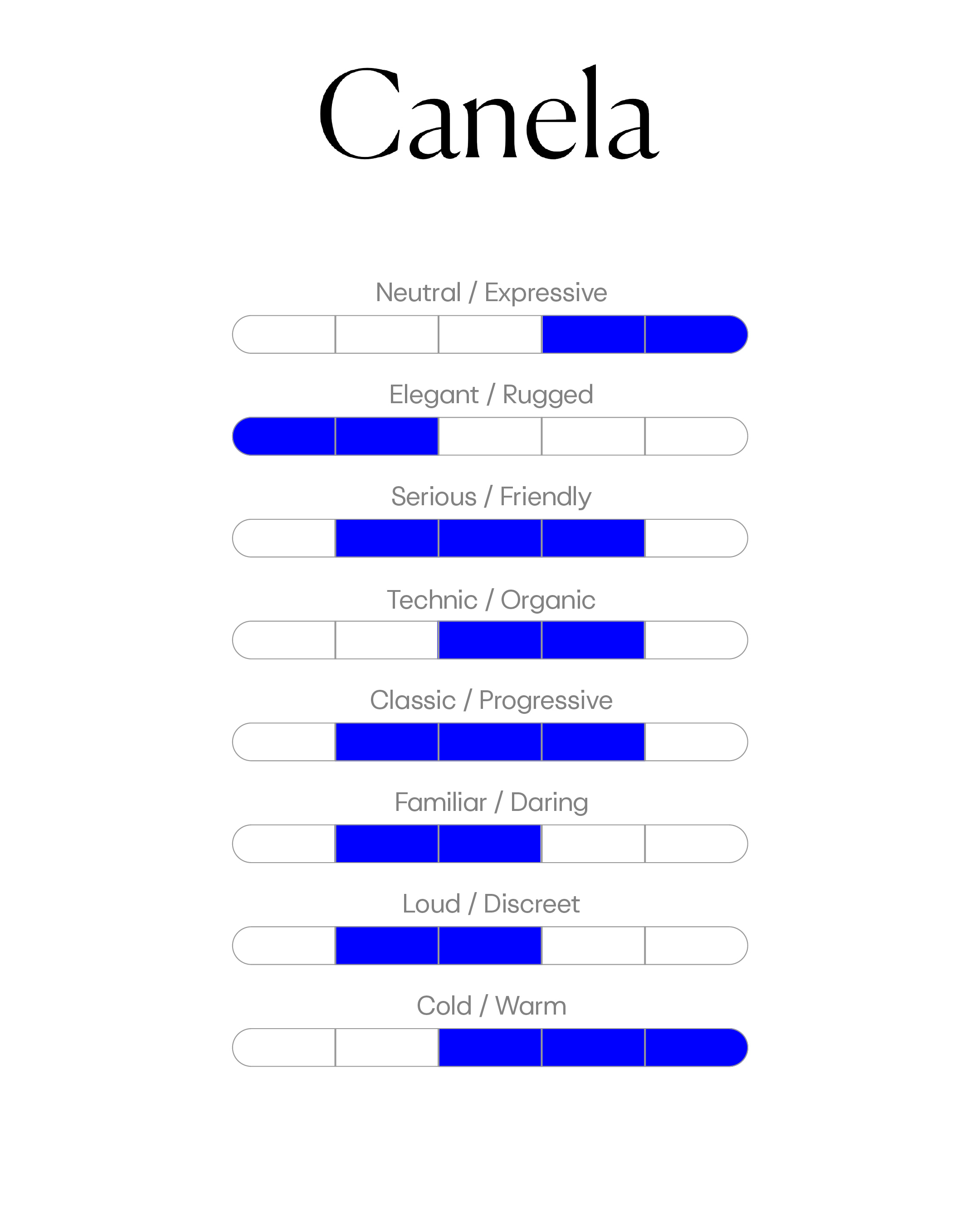
Take Canela.
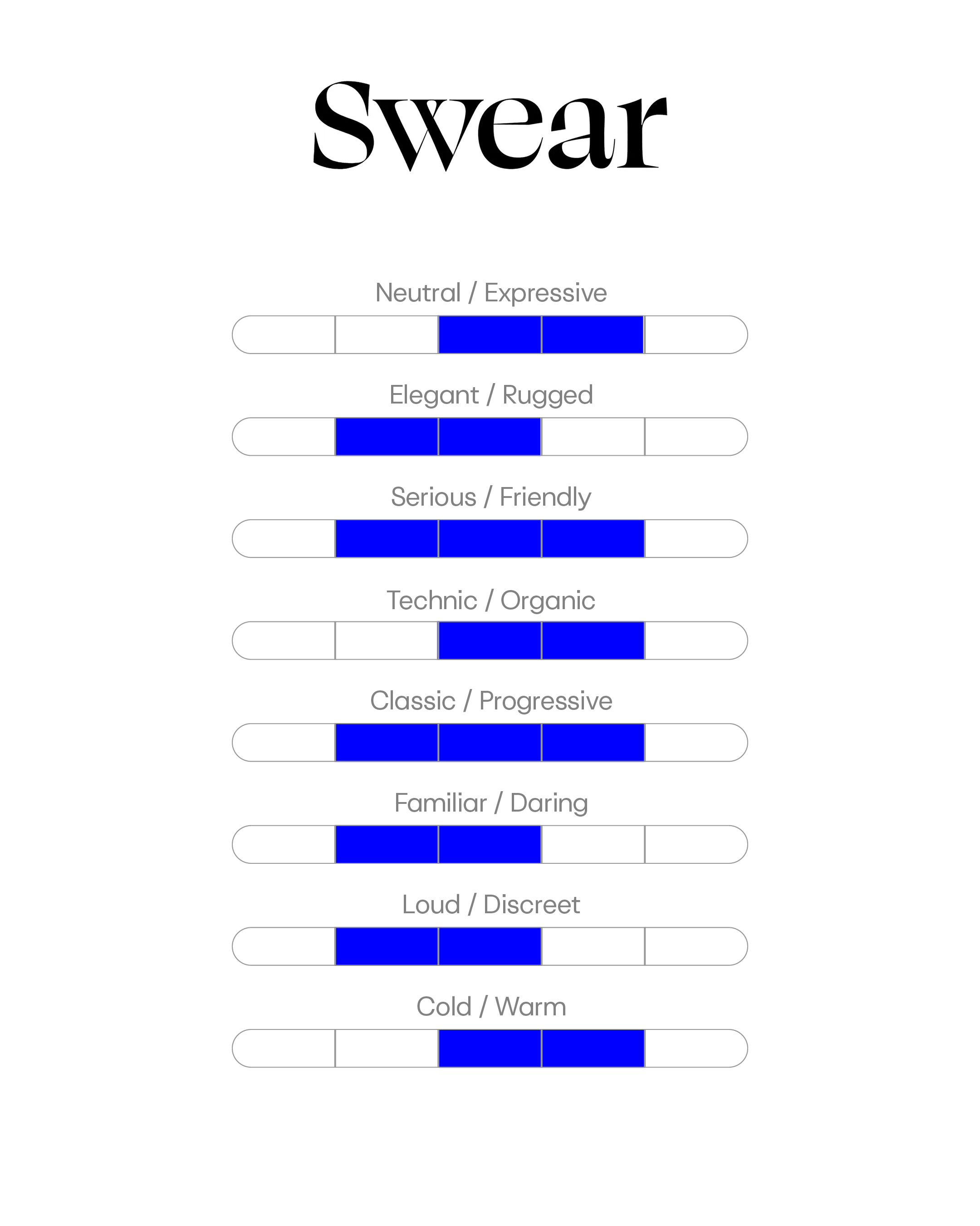
Both Swear and Canela sit in an elegant, expressive space. But their Font Brief profiles are different. Canela leans further towards elegant, expressive and warm. Swear is more balanced across the scales.
That does not tell us whether Canela would work or fail. But it gives us a useful question to test.
If we started removing parts of Canela’s letterforms, would the qualities that made us choose it still be there?
When choosing a typeface you plan to modify, two questions are worth asking:
- What qualities in this typeface are essential to the idea?
- How much can I alter before I start losing them?